Few subjects capture pure joy on paper quite like fireworks. That burst of color exploding across a dark sky feels almost impossible to recreate until you break it down into a few simple shapes.
The good news? You don’t need to be a trained artist to draw stunning fireworks. With just a handful of lines, dots, and curves, anyone can create a dazzling display on paper in minutes.
Whether you’re making a Fourth of July card, decorating a New Year’s poster, helping your kids with a fun art project, or just looking for a relaxing doodle session, this guide has you covered.
We’ll walk through five easy firework styles from the classic starburst to the dreamy willow effect along with coloring tricks that make your drawings practically glow off the page.
Materials Needed
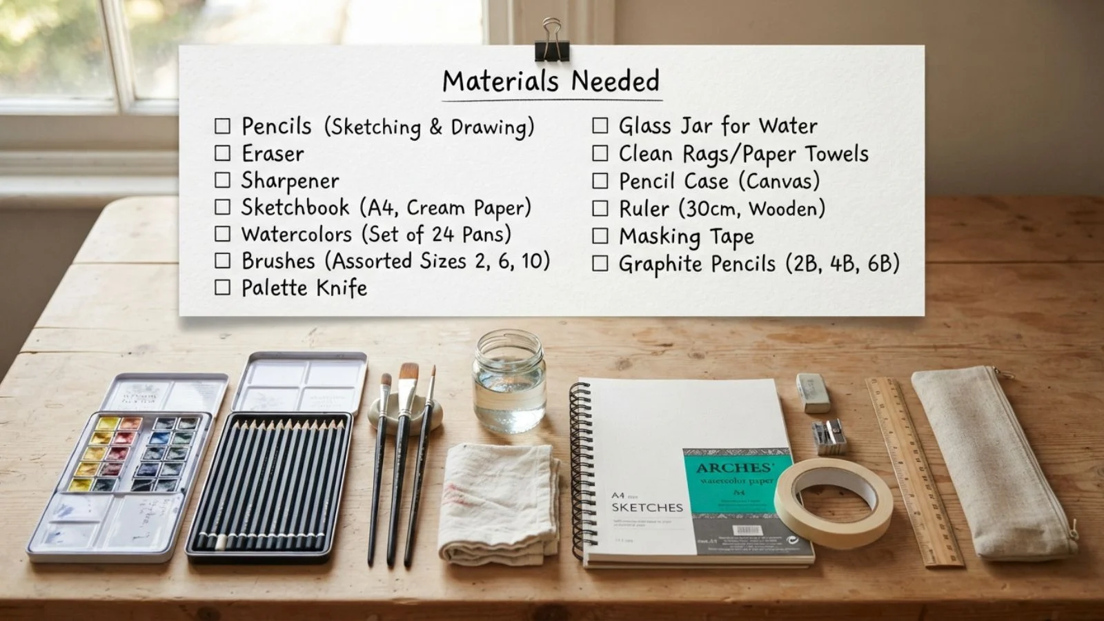
One of the best things about drawing fireworks is that you don’t need a fancy art kit to get started. Most of what you need is probably already sitting in a drawer at home.
For the basics, grab a sheet of paper, a pencil for sketching your initial lines, and an eraser for cleaning up stray marks. From there, your coloring tools are where the real magic happens. Markers work great for bold, saturated bursts of color, while colored pencils let you blend and shade for a softer, more realistic glow. If you enjoy a looser, more playful style, crayons are a fun, low-pressure option perfect for kids or quick sketches. Watercolor paint is another excellent choice if you want your fireworks to have a soft, luminous quality, since the paint naturally blends and spreads in a way that mimics light.
If you really want your fireworks to pop, consider drawing on black or dark blue paper instead of white. Paired with metallic gel pens, white paint, or white colored pencils, dark paper instantly creates that dramatic night-sky effect without any extra shading work.
For those who prefer working digitally, apps like Procreate or even simple drawing tools on a tablet work beautifully too. They offer the added bonus of unlimited undos, which is great for experimenting with different firework shapes before committing.
If tools you choose, keep it simple. The techniques in this guide work with any medium, so feel free to use whatever you already have on hand.
Understanding Firework Anatomy
Before you start sketching, it helps to understand what actually makes up a firework’s visual explosion. Once you recognize these basic parts, drawing convincing fireworks becomes much easier. You’re simply combining a few repeatable elements rather than trying to freehand something random.
Every firework starts with a central burst point, the spot where the explosion originates. Think of this as the “core” of your drawing, even if you don’t always mark it directly. From that point, radiating trails or streaks shoot outward in all directions. These lines determine the overall shape and personality of your firework: straight lines create a classic starburst, while curved lines produce softer, more organic shapes like peonies or willows.
At the very tips of these trails, you’ll typically add sparks or dots. These represent the small bursts of light where the firework fades out, and they’re what give your drawing that sparkly, dynamic feel. Varying the size of these dots, some larger, some tiny, adds realism and depth.
Finally, most fireworks include a trailing smoke or launch line, a thin, slightly curved line extending from the ground or bottom of the page up to the burst point. This detail instantly makes your drawing feel more dynamic, as if you’ve captured the fireworks mid-flight rather than frozen in one static moment.
Once you can identify these four elements: burst point, radiating trails, spark tips, and launch trail you’re ready to start applying them to specific firework styles.
The Classic Starburst
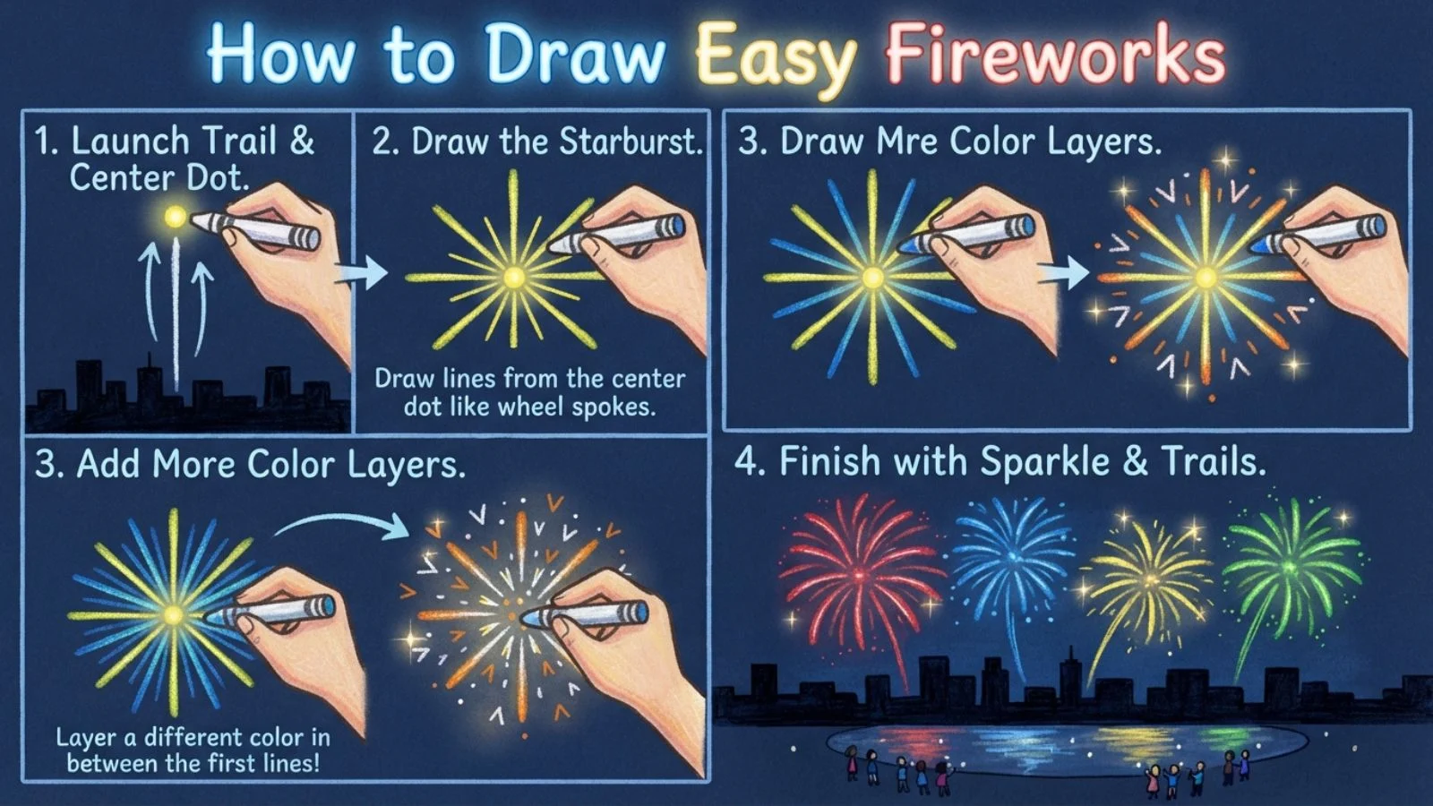
The starburst is the most recognizable firework shape, and it’s the perfect place to start if you’re a beginner. With just straight lines and dots, you can create a bold, eye-catching explosion in under a minute.
Begin by lightly marking a center point on your page with your pencil; this is where all your lines will originate. From that point, draw six to eight straight lines radiating outward in different directions, like spokes on a wheel. Try to space them fairly evenly, but don’t stress about perfection; slight irregularity actually makes the drawing look more natural and less mechanical.
Next, vary the length of a few lines so they’re not all identical. This small tweak adds movement and keeps the burst from looking too stiff or symmetrical. At the end of each line, add a small dot or short “V” shape to represent a spark. For extra detail, you can add a couple of shorter secondary lines branching off the main ones, mimicking the way real fireworks split as they burn out.
Once your pencil sketch looks good, trace over it with your marker or colored pencil of choice, pressing a little harder near the center and lighter toward the tips. This subtle pressure change creates a natural fade effect, making the burst look like it’s glowing outward from the core.
The starburst technique is simple, fast, and endlessly customizable, a perfect foundation before moving on to more advanced shapes.
The Peony/Chrysanthemum Firework
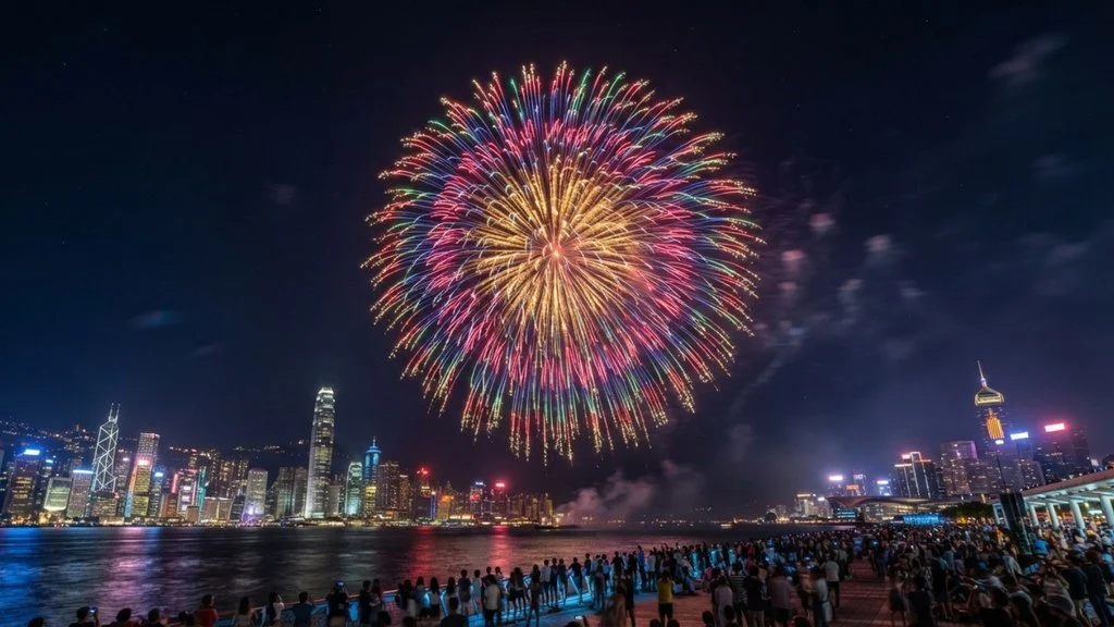
Once you’ve mastered the straight-line starburst, the peony firework is a natural next step. Named after the flower it resembles, this style swaps sharp, straight lines for soft, curved ones giving your drawing a fuller, more layered look that’s still surprisingly easy to create.
Start the same way as before: mark a light center point on your page. This time, instead of straight spokes, draw gently curved lines radiating outward, similar to flower petals. Aim for a slight arc in each line rather than a perfectly straight path even a subtle curve is enough to create that soft, blooming effect.
To build fullness, add a second layer of shorter curved lines nestled between your first set. This layering is what gives the peony firework its signature “many-petaled” appearance, making it look more complex than it actually is to draw. Don’t worry about spacing everything perfectly evenly; natural variation makes the burst feel more organic.
At the tip of each curved line, add a small dot or teardrop shape to represent the spark, just as you did with the starburst. For extra realism, try making the dots slightly different sizes.
When coloring, consider using two shades of the same color: a deeper tone near the center and a lighter one toward the tips to mimic the way light naturally fades outward. This simple gradient trick instantly makes your peony firework look more dynamic and dimensional.
The Willow Firework
The willow firework is where your drawings really start to feel alive. Named after the graceful, drooping branches of a willow tree, this style creates a soft, cascading effect that looks especially beautiful when a few are drawn together across a night sky.
Start with your usual center point, but this time, draw your radiating lines curving downward as they extend outward, rather than staying straight or arcing upward like the peony. Think of the motion as an umbrella opening and then drooping the lines should begin fairly straight near the center and gradually bend downward toward their tips, mimicking gravity pulling the sparks back to earth.
Keep your lines long and slightly wavy rather than short and rigid; this elongated shape is what gives the willow its signature “falling” quality. Unlike the tighter starburst or peony, willow fireworks tend to look best with fewer, more spaced-out lines, since the drooping shape needs room to breathe.
At the end of each line, add small dots that gradually decrease in size, trailing off like fading embers. You can even add a few tiny detached dots below the main tips to suggest sparks continuing to fall after the main burst.
For coloring, warm tones like gold, orange, or soft yellow work beautifully for willow fireworks, evoking the look of glowing embers. Adding a subtle gradient brighter near the top, fading toward the bottom enhances that drifting, weightless effect even further.
The Ring/Circle Firework
The ring firework offers a fun departure from the radiating-line styles you’ve practiced so far. Instead of lines shooting outward from a single point, this technique uses a circular formation of sparks, creating a neat, symmetrical halo effect that stands out beautifully against a night sky.
Start by lightly sketching a circle with your pencil; this acts as your guide and won’t appear in the final drawing. Around the circumference of this circle, draw small, evenly spaced dashes or short lines pointing outward, almost like the numbers on a clock face. Aim for a consistent rhythm, since evenness is what gives the ring firework its clean, polished look.
At the tip of each short dash, add a small dot to represent the spark, just as with previous techniques. If you want a fuller ring, add a second, slightly smaller set of dashes just inside the first ring, creating a subtle double-layer effect.
For an extra decorative touch, try adding a few thin straight lines shooting outward from the very center, breaking through the middle of the ring. This gives the illusion of a secondary burst happening simultaneously, adding visual interest to what might otherwise be a simple shape.
When coloring, ring fireworks look especially striking in bold, saturated colors like red, blue, or green, since the uniform shape lets the color itself become the star of the drawing. Once you’re comfortable with this technique, erase your guide circle and enjoy your perfectly symmetrical firework.
Multiple/Overlapping Fireworks
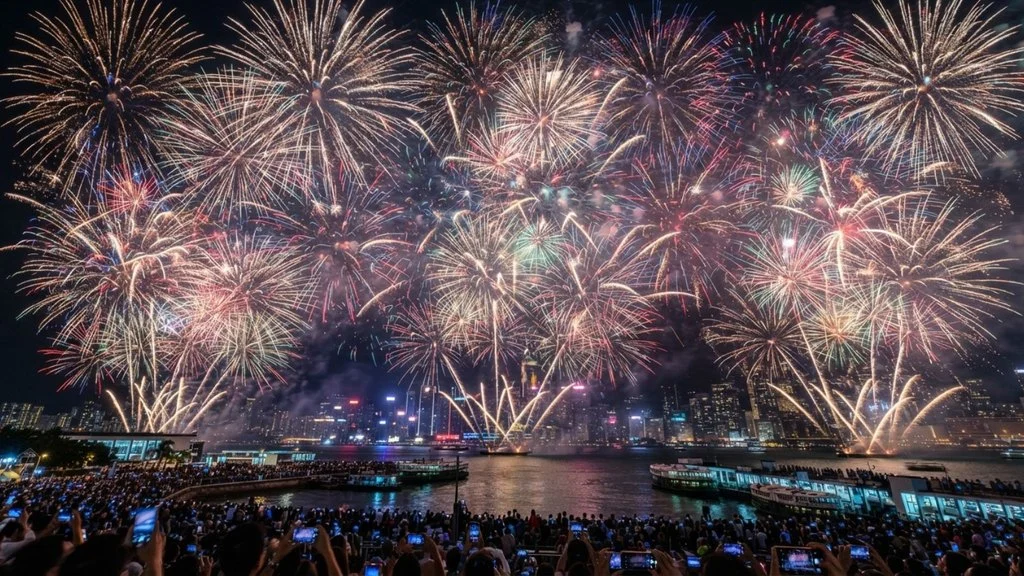
Once you’ve practiced the individual firework shapes, the real magic happens when you combine them into a single scene. Layering multiple fireworks together instantly transforms a simple sketch into a lively, celebratory display that feels much more impressive than the sum of its parts.
Start by lightly planning your composition before adding any color. Choose three or four spots across your page at varying heights and distances to avoid lining them up too evenly, since natural, scattered placement looks far more realistic than a perfectly symmetrical arrangement. Mix and match the techniques you’ve already learned: pair a starburst with a peony, or place a willow firework drifting near a ring burst, so each explosion has its own distinct personality.
To create a sense of depth, vary the size of each firework based on its position. Fireworks drawn larger and closer to the “front” of the scene should have bolder lines and brighter colors, while smaller ones toward the background can use thinner lines and slightly muted tones. This size and intensity contrast tricks the eye into perceiving distance, even on a flat page.
Be mindful of overlap; it’s fine, and even desirable, for the trailing lines of one firework to cross behind another, as this mimics how real fireworks layer in the sky. Just avoid overcrowding in one area, which can make the drawing feel cluttered rather than dynamic.
Finish by adding a few small, scattered dots throughout the empty space to suggest lingering sparks, tying the whole composition together.
Adding the Launch Trail
A firework drawing feels complete the moment you add a launch trail that thin streak of light rising from the ground up to the burst point. This small detail makes a huge difference, transforming a static explosion shape into a dynamic scene that feels like it’s captured mid-flight, still climbing into the night sky.
To draw a launch trail, start from the bottom of your page (or from a rooftop, tree line, or horizon if you’ve included one) and draw a single, slightly curved line rising up toward the center of your firework burst. Avoid making this line perfectly straight, a gentle curve, almost like a check mark or a soft “S,” makes the trail feel more natural, as if it’s responding to air resistance as it climbs.
Rather than drawing one solid, continuous line, try breaking it into small dashes or short strokes. This creates the impression of a fast-moving spark trail rather than a solid rod, which reads as far more realistic and energetic. You can also add a few tiny dots trailing off to the sides of the main line, suggesting stray sparks falling away during the ascent.
For multiple fireworks in one scene, stagger your launch trails at different heights and angles so they don’t feel repetitive. Coloring the trail in a warm gold or white, even if the firework itself is a different color, mimics the bright burning trail of the initial fuse realistically.
Coloring & Shading Tips

Color is what truly brings a firework drawing to life, and a few simple techniques can make your artwork look far more polished than the linework alone suggests.
Start by thinking about contrast. Fireworks are meant to pop against a dark backdrop, so if you’re working on white paper, consider shading in a deep navy, black, or purple background before adding your fireworks on top. If you’re using black or dark-colored paper, you get this contrast for free, letting your colors glow immediately without extra shading work.
Within each individual firework, aim for a gradient effect rather than one flat color. Apply your color more heavily near the center burst point, then ease off the pressure as you move toward the tips of each line, letting the paper show through slightly. This creates a natural fade that mimics how light actually disperses. For an even more advanced look, try blending two related colors like hot pink fading into pale yellow within the same firework for a fiery, multi-tone effect.
Highlights matter just as much as color. A white gel pen or white colored pencil dotted at the very center of the burst, or along the brightest edges of each line, instantly adds a sense of glow and dimension.
Finally, don’t overlook the sky around your fireworks. Scatter a few tiny white dots for stars, and consider a soft smudge of color low on the page to suggest ambient light bouncing off nearby buildings or trees, grounding your fireworks in a believable night scene.
Background Ideas
While the fireworks themselves are the star of the show, the background you choose plays a major role in how professional and atmospheric your final drawing feels. Fortunately, even simple backgrounds can dramatically elevate your artwork with minimal extra effort.
The most classic choice is the night sky. A deep gradient from navy blue at the top to a slightly lighter purple or blue near the horizon instantly sets the scene. Scatter a handful of small white dots throughout for stars, and consider adding a soft, glowing moon off to one side for extra atmosphere. This background works beautifully behind any of the firework techniques covered earlier.
If you want to add context and scale, try including a simple skyline silhouette along the bottom of your page. A row of dark, flat-colored buildings, trees, or even mountain shapes instantly grounds your fireworks in a specific setting, whether that’s a city celebration or a countryside gathering. Because silhouettes are solid black or one dark color, they’re incredibly forgiving to draw. You don’t need architectural precision, just simple, recognizable shapes.
For an even quicker option, a plain gradient background alone can be stunning. Blending two or three shades of blue or purple from dark to light creates depth without requiring any additional linework.
If you’re short on time, don’t feel obligated to add a detailed background at all. Sometimes leaving the fireworks on a solid black page allows the color and light to command all the attention.
Common Mistakes to Avoid
Even simple drawings can go wrong in small ways that undermine the final result. Knowing what to watch for ahead of time will save you frustration and help your fireworks look polished on the first try.
One of the most frequent mistakes is uneven spacing between the radiating lines of a burst. When lines are clustered too closely on one side and too sparse on the other, the firework can look lopsided rather than intentional. A helpful trick is to lightly sketch a few guide dots in a rough circle around your center point before drawing your lines, giving you evenly spaced anchor points to work from.
Another common pitfall is using too many colors within a single firework. While it’s tempting to make your drawing as vibrant as possible, packing in four or five different colors often creates a muddy, chaotic look rather than a clean burst of light. Stick to one or two complementary colors per firework, and let variation come from value and gradient rather than an overwhelming color palette.
Overworking soft mediums, like watercolor or blended colored pencil, is another easy trap. Going over the same area repeatedly can smudge your lines or muddy your colors, especially with wet media. Work in light layers, and let each pass dry or set before adding more detail on top.
Easy Variations for Kids
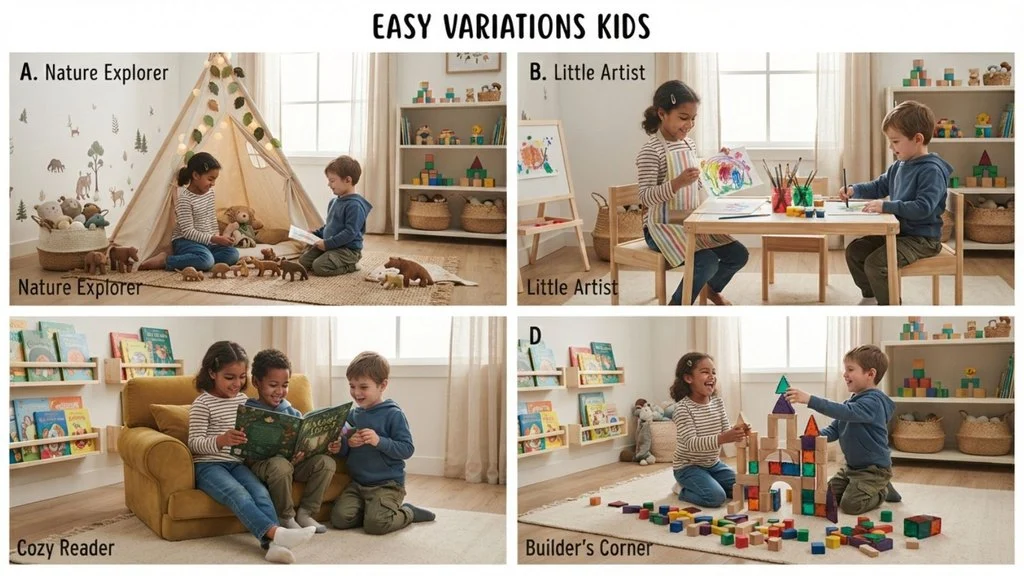
Drawing fireworks is a fantastic activity for kids, but younger artists often need simplified techniques and a little extra structure to feel successful. The good news is that fireworks are naturally forgiving even loose, imperfect shapes still read as recognizable bursts of light.
For young children still developing fine motor control, simplify the starburst technique down to its bare essentials: a center dot and six to eight straight lines radiating outward, with a bigger dot at each tip. Skip the layering and shading techniques meant for older kids or adults, and instead focus on bold, bright colors applied with markers or crayons, which are more forgiving than pencils for little hands.
Household objects can also make firework drawing more playful and accessible. Pressing the edge of a fork dipped in paint onto paper creates an instant radiating burst pattern, while a cotton swab dipped in white or metallic paint makes quick, easy spark dots. Bubble wrap dipped in paint and stamped onto the page can even mimic a cluster of tiny sparks with almost no drawing skill required.
Stencils are another great option for kids who want a cleaner result without needing precise linework. A simple firework-shaped stencil, cut from cardstock or found online, lets children trace or sponge-paint the outline before adding their own colors and details inside.
Consider offering a printable firework template with pre-drawn guide lines, letting kids focus purely on coloring, decorating, and adding their own creative sparks and details.
Step-by-Step Recap / Quick Reference
If you’ve made it this far, you now have everything you need to draw confident, dynamic fireworks in just a few simple steps. Here’s a quick reference to keep handy whenever you want to jump straight into drawing without rereading the full guide.
Start by lightly marking a center point on your page that anchors every firework style. From there, choose your line style based on the look you want: straight lines for a classic starburst, gently curved lines for a fuller peony, downward-curving lines for a drooping willow, or a circular arrangement of short dashes for a clean ring burst. Add small dots or teardrop shapes at the tip of each line to represent sparks, varying their size slightly for realism.
Once your basic shape is sketched, add a curved, dashed launch trail rising from the bottom of the page to the burst point, giving the impression of motion. If you’re drawing multiple fireworks, vary their size, placement, and style across the page to create natural depth, allowing some trails to overlap for a layered, lively composition.
When it’s time to color, work from the center outward, applying heavier pigment near the burst point and fading toward the tips. Add white highlights for glow, and consider a dark background navy, purple, or black to make your colors pop.
Finally, don’t forget the small finishing touches: scattered stars, a soft skyline silhouette, or a glowing moon can turn a simple sketch into a complete, atmospheric scene.
FAQ Section
How do you draw a firework easily?
The simplest method is the classic starburst: mark a center point, draw six to eight straight lines radiating outward like spokes, and add a small dot at the end of each line to represent a spark. This basic shape takes less than a minute and works as a foundation for every other style covered in this guide.
What’s the easiest firework shape to start with?
The starburst is the most beginner-friendly option since it only requires straight lines and dots, with no curves or complex layering involved. Once you’re comfortable with it, the peony and ring styles are natural next steps.
How do you make fireworks look like they’re glowing?
Glow comes down to gradient shading and contrast. Apply color more heavily near the center burst point and lighten your pressure toward the tips, then add white highlights at the core and brightest edges. Drawing on black or dark blue paper also creates instant glow without extra shading work.
Can you draw fireworks without paint?
Absolutely. Markers, colored pencils, and even crayons work perfectly well for every technique in this guide. Watercolor and paint can enhance the glowing effect, but they’re entirely optional. Plenty of stunning firework drawings are created with nothing more than a few colored pencils or markers.
Do fireworks need to be symmetrical?
Not at all. Slight irregularity in line spacing and length actually makes fireworks look more natural and dynamic, rather than stiff or mechanical.
Conclusion
Drawing fireworks may look intricate at first glance, but as you’ve seen throughout this guide, the secret lies in breaking the image down into a handful of simple, repeatable elements: a center point, radiating lines, spark tips, and a launch trail.
Once you’re comfortable combining these basics, you have everything you need to create five distinct firework styles and countless variations of your own.
The best part about this subject is how forgiving it is. Unlike drawings that demand precise proportions or realistic detail, fireworks thrive on a little imperfection.
Uneven lines, varied spacing, and spontaneous bursts of color all contribute to a more lively, authentic result.
There’s no single “correct” way to draw a firework, which makes it an incredibly freeing subject for artists of any skill level, from young kids experimenting with stamps and stencils to adults looking for a relaxing, low-pressure sketching session